


NV Trafford
Designer & Freelance Illustrator
Hey there, I'm Kenny! I'm a Graphic Designer, and self taught Illustrator living in Kingston, Ontario. I grew up on a farm in the woods and tend to take inspiration from creatures and the wilderness. Animals and fantasy creatures are fascinating, so I try to incorporate them into my art wherever possible. My goal with my illustrative work is to balance rustic and mystical themes to invoke feelings of nostalgia, whimsy and comfort.When I'm not drawing, I enjoy tinkering on my computer, modding and redesigning user interface elements for video games. Contrary to my often bold art style, I strive to keep my design work clean and polished. I am of the opinion that good design should be invisible, focusing more on creating straightforward visuals and functional solutions.


Background
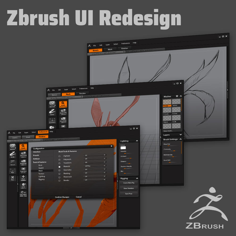
For our final "capstone" project in the Graphic Design Program at SLC, we were given the opportunity to pursue any project we wanted. I chose to reorganize the Zbrush application and redesign its UI. The main problems was with the organization of information and features. My preliminary research revealed that the software was unapproachable to most new users, and that the users who excelled in learning to navigate the software already had experience with 3D software such as Blender. To solve this, I took inventory of ALL the features and tools, and categorized them in simple terms.
Tools
The tools in the initial prototype were too large and as a result they interfered with the size of the workspace. To alleviate this issue, they were decreased in size and were reordered to take up less space; the consistent tools were separated from the changing tools so that the changing tools could be
decreased further in size without causing any inconsistency in the design.
Advanced Tools and Features
While the simplified layout works well for new users, advanced users need to understand where to find the tools that they would regularly use. Two
mock-up screens were added to demonstrate where the bulk of Zbrush features can be located. The new organization of features and toolbars allows advanced users to customize the software quickly and easily.
Modes
After initially organizing the workspace into five sections, it was further simplified into 3. The Texture, Pose, and Lighting modes were condensed into a single “Finishes” mode so that users could add final touches to a project without having to switch between the last three modes. Mode buttons were also treated differently depending the stage of a user’s workflow. Since it is impossible to move backwards through modes, (ex: sketching over meshes or remodeling a mesh after applying some textures) each previous mode was changed to appear “greyed out” whenever a user progressed to the next mode. This gives users a visual indication that they can no longer edit in the previous mode.
Controls
The constant tools consist of controls that allow users to move the camera around the canvas/model. Shortcuts were added to allow users to gradually learn how to quickly manipulate the canvas without pressing any buttons. These shortcuts would change depending on the users operating system and hotkey settings (adjustable from the preferences menu). For advanced users —or when new users are more comfortable with the software— there is an option to hide these tools to free up more workspace area.
Workspace
The canvas area is the most important part of the software and needed to be as large as possible. The larger size was achieved through resizing different elements (modes, tools, trays etc.) and a screen was added to demonstrate the full size of the canvas if all the trays were hidden. This allows the tools to be accessed when needed, and to give the users as much space as possible to work on sculpting and model creation.
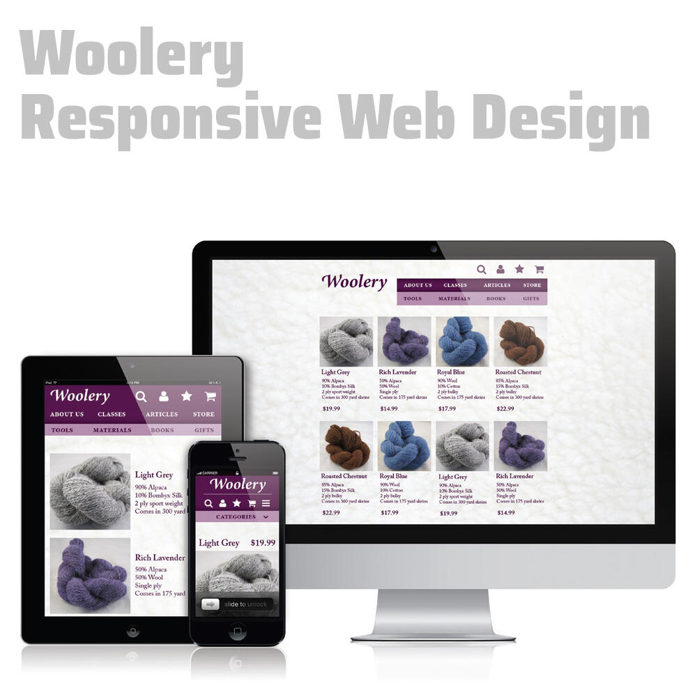
Woolery Website Redesign
This was a responsive, mobile-first website redesign project where the main goal was accessibility from three specific breakpoints PC, tablet or smartphone. The goal was to create a design simple enough that it would work from a mobile device, then scale it up to function on larger screens.

Other Design Decisions
The original green of the current website was changed to a more feminine purple to appeal to the target audience, and to add a luxury feel to the products. The background was also given a subtle wool texture to tie into the subject matter. Navigation items were simplified into symbols at smaller breakpoints, while full labels were used at larger breakpoints to create a sense of balance.


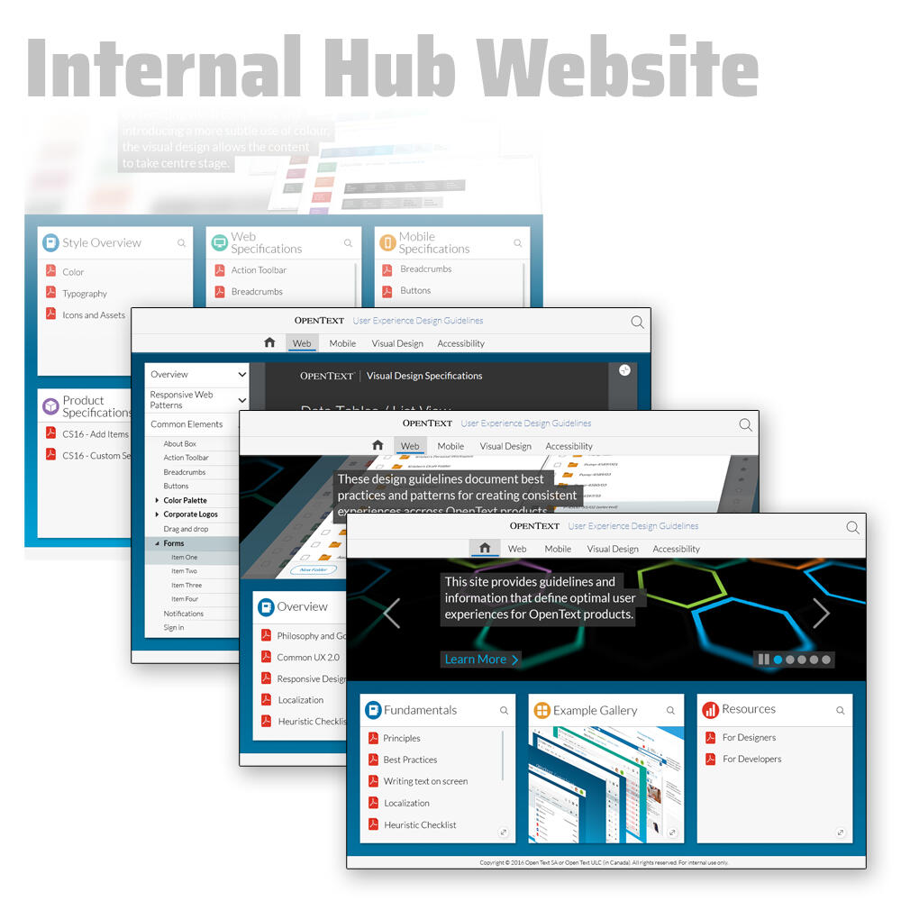
Open Text Internal Website Design
In the final year of Graphic Design at Saint Lawrence, we were given 3 week placement opportunity. I pursued work at OpenText, a Canadian software company that develops and sells enterprise information management software.The first project I worked on for OpenText was a design for an internal website that would function as a hub for programmers and designers alike. The purpose of the website was to organize and store all of the various design specification documents that allow everyone in the company to keep designs consistant accross the entire opentext suit. It's important that the guidelines are easy to find because they are so regularly referred to while doing work at the company. There are hundreds of programs in the OpenText suite, and new aquisitions are made often and need to be modified to fit the same design language. Any changes made to the stlye guidelines will also need to be applied to all OpenText software.The second part of this project was to double check and make modifications according to the aforementioned design specification documents. I then created a document to show other OpenText employees how to edit my design while staying within these specific design parameters.


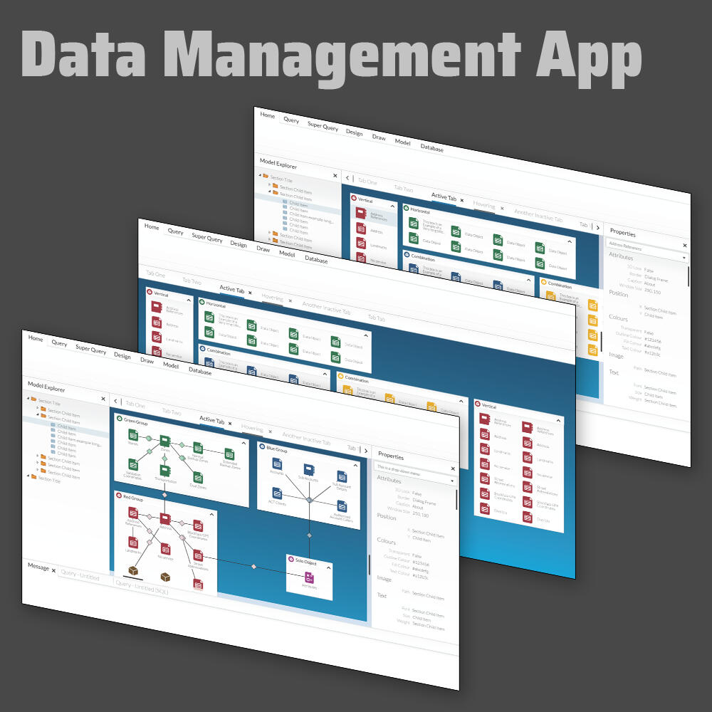
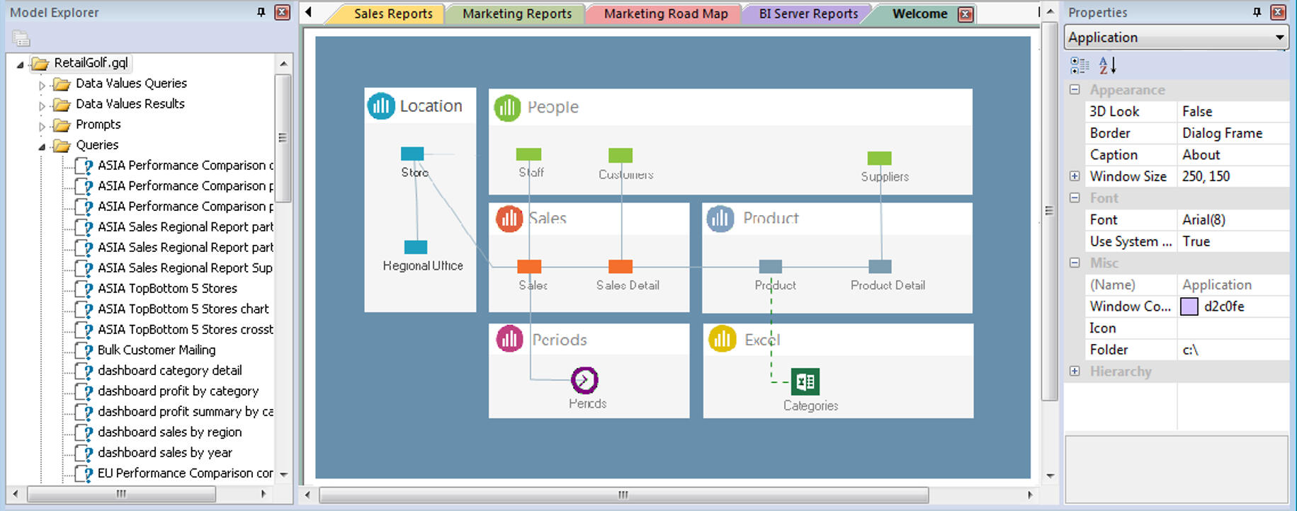
Business Intelligence Model
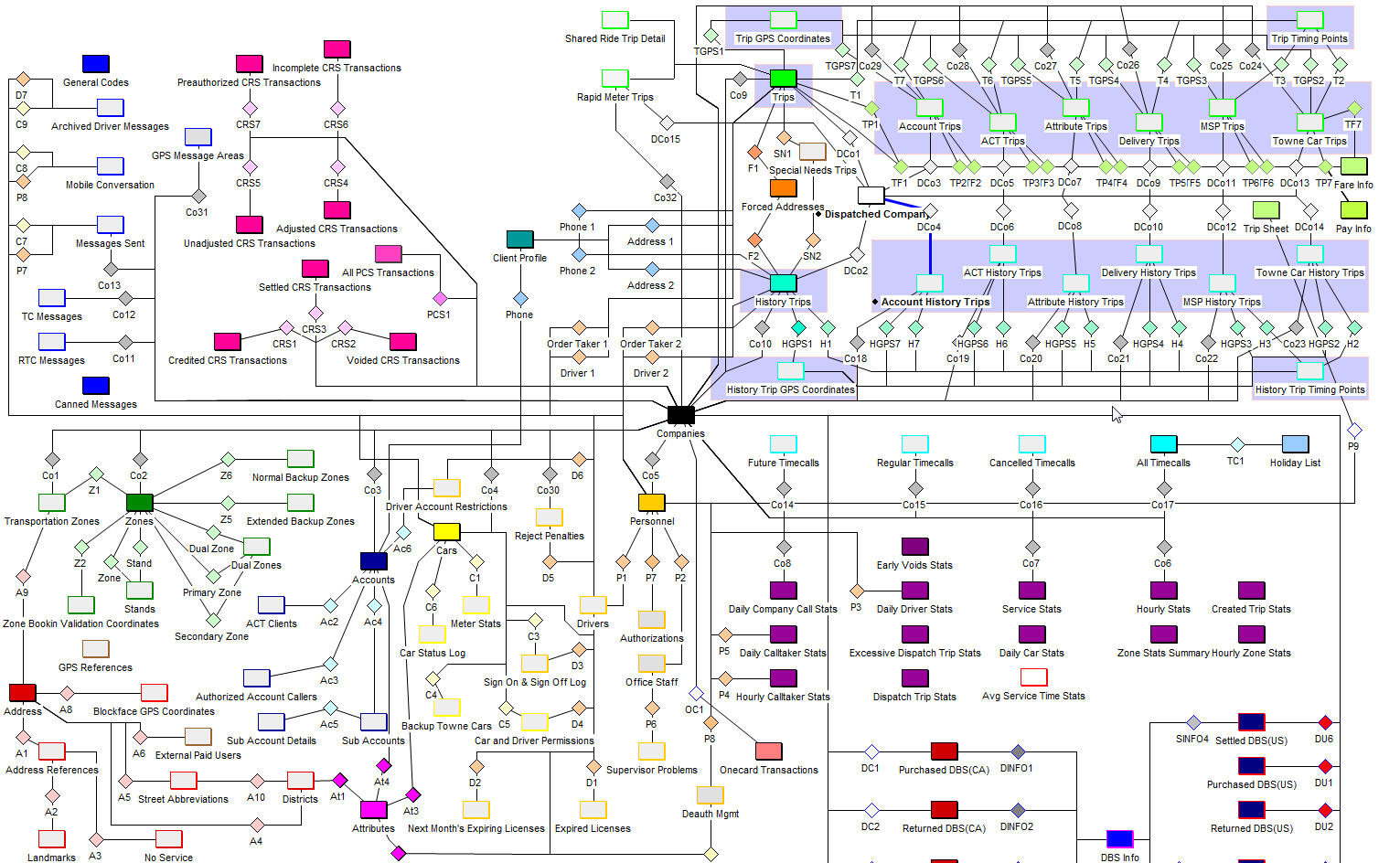
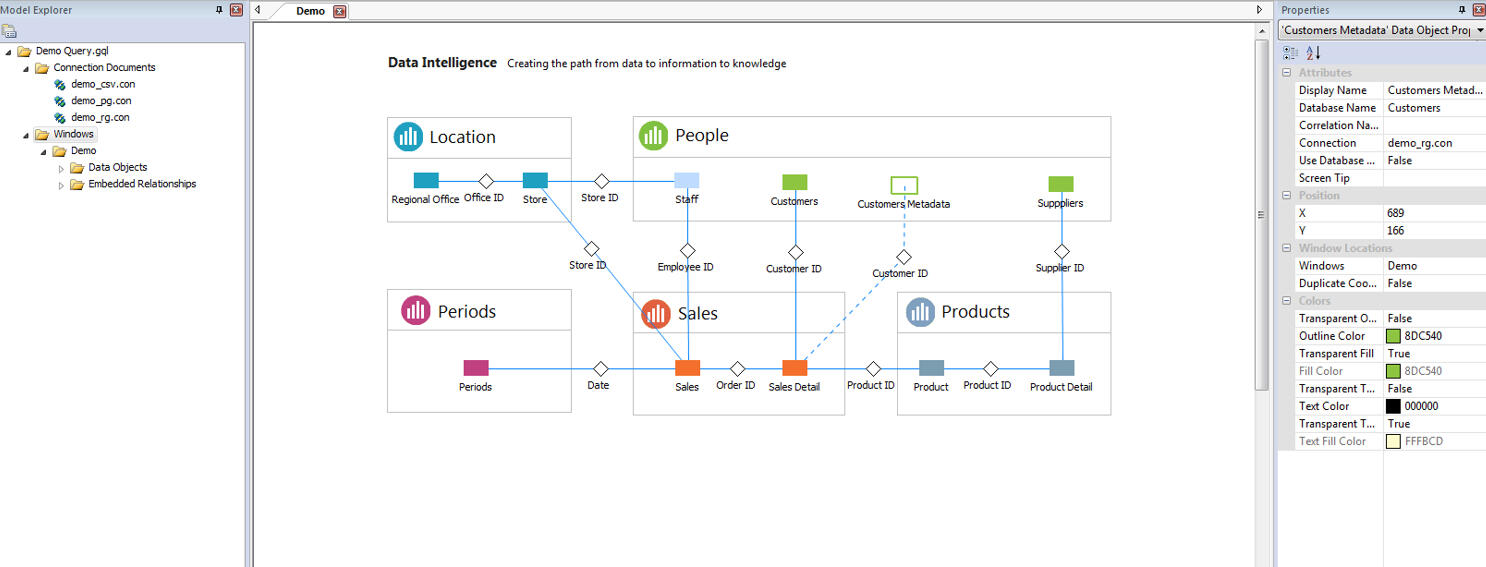
In the final year of Graphic Design at Saint Lawrence, we were given 3 week placement opportunity. I pursued work at OpenText, a Canadian software company that develops and sells enterprise information management software.The second project I worked on for OpenText was a user interface design for their internal Business Management software. This software essentially functioned as a visualization of an SQL database. It was also important to show the relationships between the software and how the programs interacted with each other.I was given a screenshot of the current business model to demonstrate the issues, and how complicated the visual interface can get without an organized approach. For privacy reasons, I only used generic labels for all the sample items in my own design.While designing the model, I made use of the design specification documents that I had been introduced to in the first project. My designs were created within specific design standards, dictated by these documents. This ensured that the end project would blend in seamlessly with the rest of OpenText's visual language.
Original Design Concept (via visual studio basic)

Untitled

Untitled

Untitled


Overview
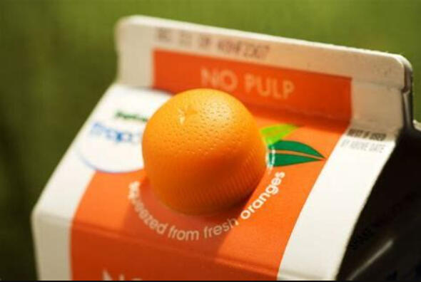
The aim of this project was to redesign a Tropicana juice box. The new packaging retains the Tropicana look and feel and iconic imagery of the straw in an orange. The juice box was designed to be unique enough to stand out among similar products, while still clearly demonstrating what the product is and what the company stands for, premium, fresh orange juice.
Background
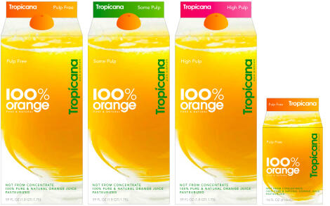
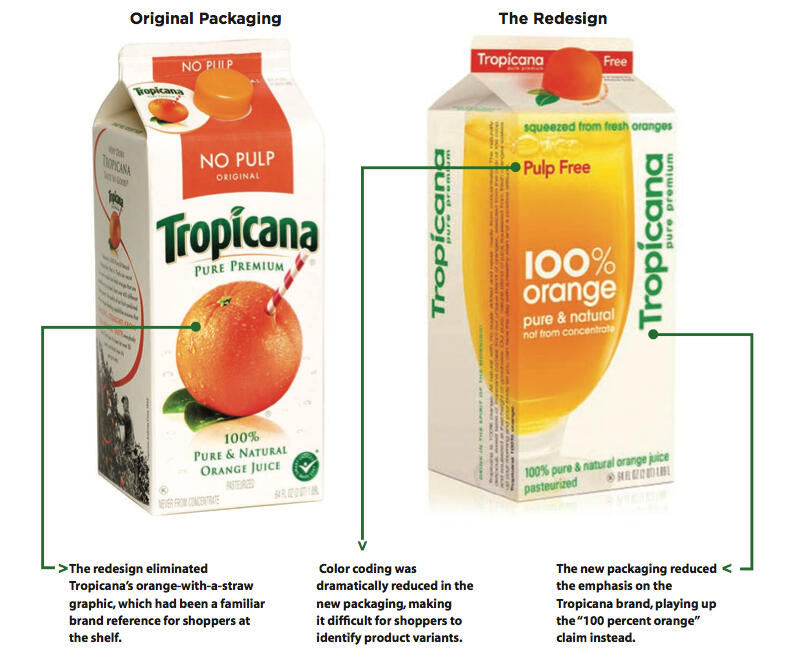
Tropicana is most known for its orange juice and classic branding. Like other juices, their products used to come in a typical rectangular carton. On January 8th 2009, Tropicana launched the new packaging for its best-selling product in North America – Tropicana Pure Premium, with sales revenues reaching more than 700 million dollars per year. A few days later, consumers started criticizing the new design, especially on social networks. Two months later, sales dropped by 20%, and this spectacular decrease in sales represented a lost of 30 million dollars for Tropicana.This dramatic negative reaction was a direct result of changing too many brand elements at the same time. The character from the unique logotype, as well as the iconic straw-in-the-orange symbol were completely lost in the new packaging. This alienated consumers as the product was no longer recognizable as Tropicana.Watching this unfold sparked my curiosity; how could the redesign have been handled better? My first instinct, told me that leaning into the pre-established brand identity could have had the opposite effect. Luckily, the packaging redesign project we were given in the Graphic Design Program was the perfect opportunity for me to explore this idea.

New Design

Comparison
Orange Lid

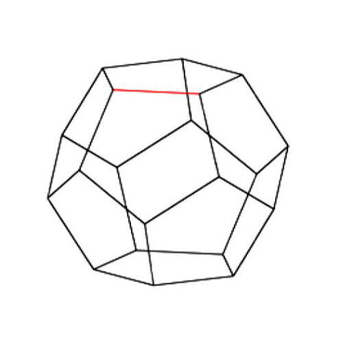
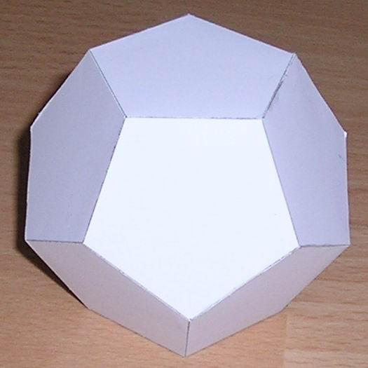
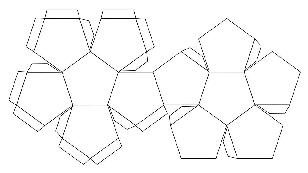
Dodecahedron

2D Net/Die cut
All Put Together


Concept
Amoug the things done improperly with the official Tropicana rebrand, consumers were the most upset about the removal of their iconic “straw-in-the-orange” symbol. It represents Tropicana’s brand value of quality as well as the pure, fresh product itself. The new packaging retains the Tropicana look and feel and reinforces their brand values through the use of this symbol. Not only will it allow viewers to clearly recognize the Tropicana brand before reading the text on the packaging, it will also function as a fun interactive package for the secondary target audience, children.
Execution
Some research was done into differeny 3D objects and how the shapes could be translated into a disposable juicebox. The shape I ultimately decided on was a dodecahedron because it similar to a sphere, has flat sides to allow the box to stand in place. Due to the geometric style, the end result looks like a low-poly orange .
The type was treated in a similar fashion to the original orange juice cartons, as reasearch revealed that consumers dislike when too many things change at once. Minimal text content was used to strengthen the “pure-orange” concept. Instead, the label was printed onto a sticker similar to those found on real oranges. The nutritional value was also hidden on the bottom of the package as to not interfere with the design of the orange and so that the package could function as a stand-alone product that could be sold on its own.
"Sticker" Element
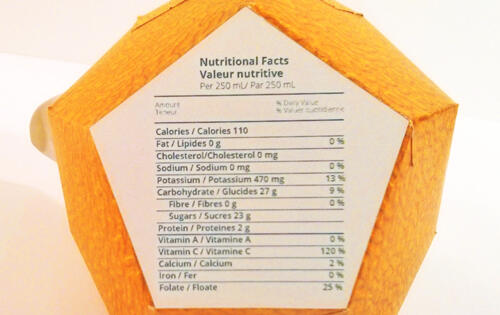
Nutritional Info


The overall design appeals more to the primary audience; adults
purchasing the products will understand the reference and the
Tropicana brand values. Children will be interacting more with the actual
package design. To accommodate this, easy to read words are used on
the packaging and instructions are included. The package also features
a leaf that peels away to reveal the hole for the straw. The unique
shape and appearance of the carton is more attractive to children in
the sense that it is playful and entertaining to interact with.


Untitled

Untitled

Untitled
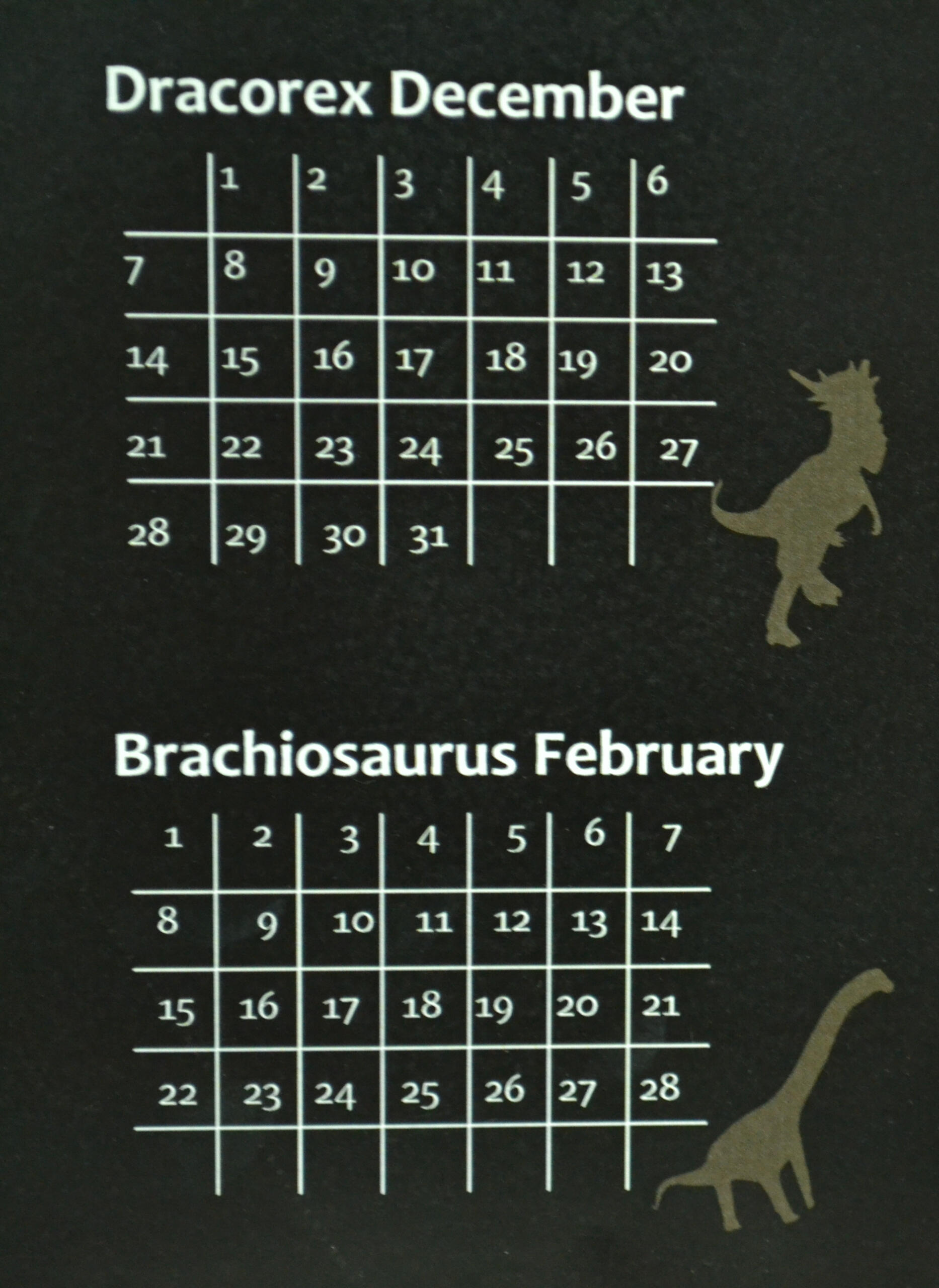
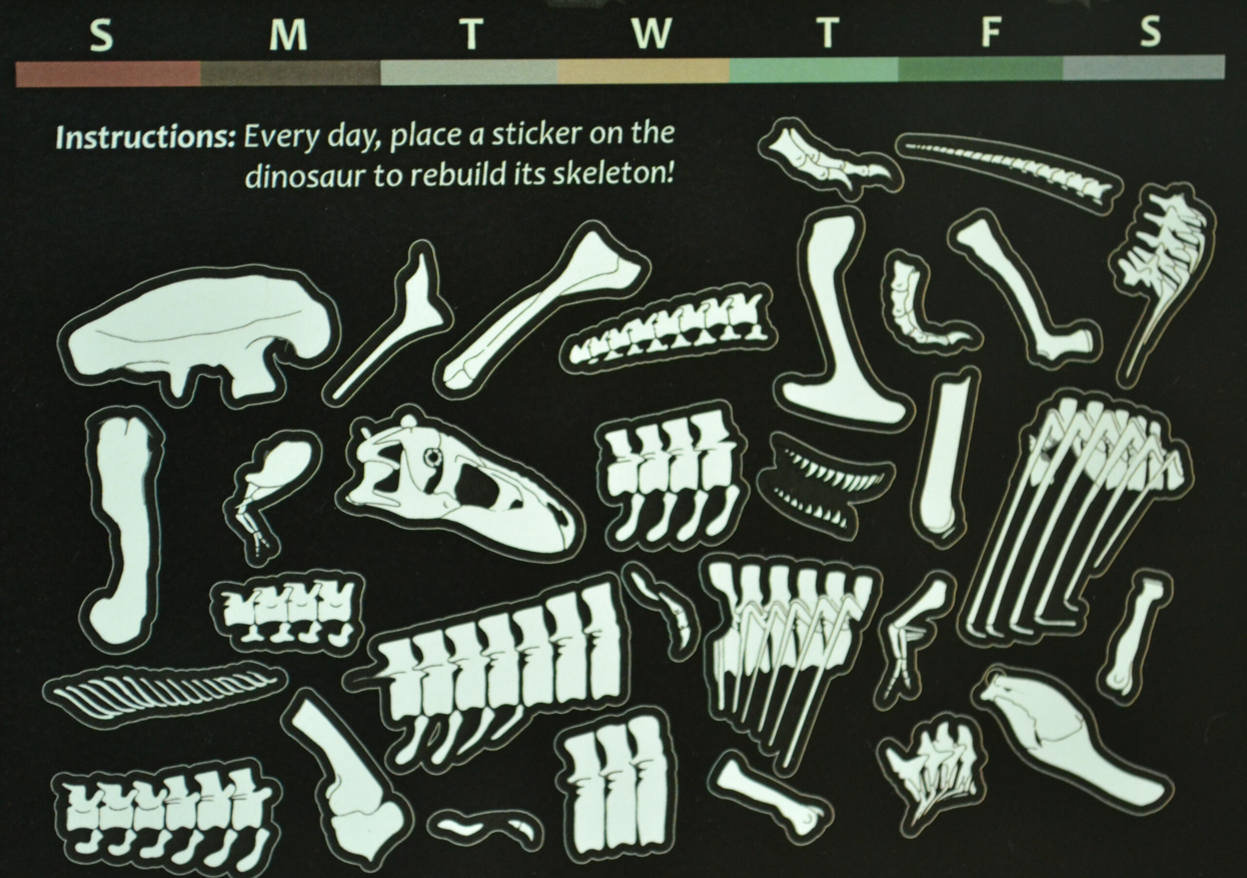
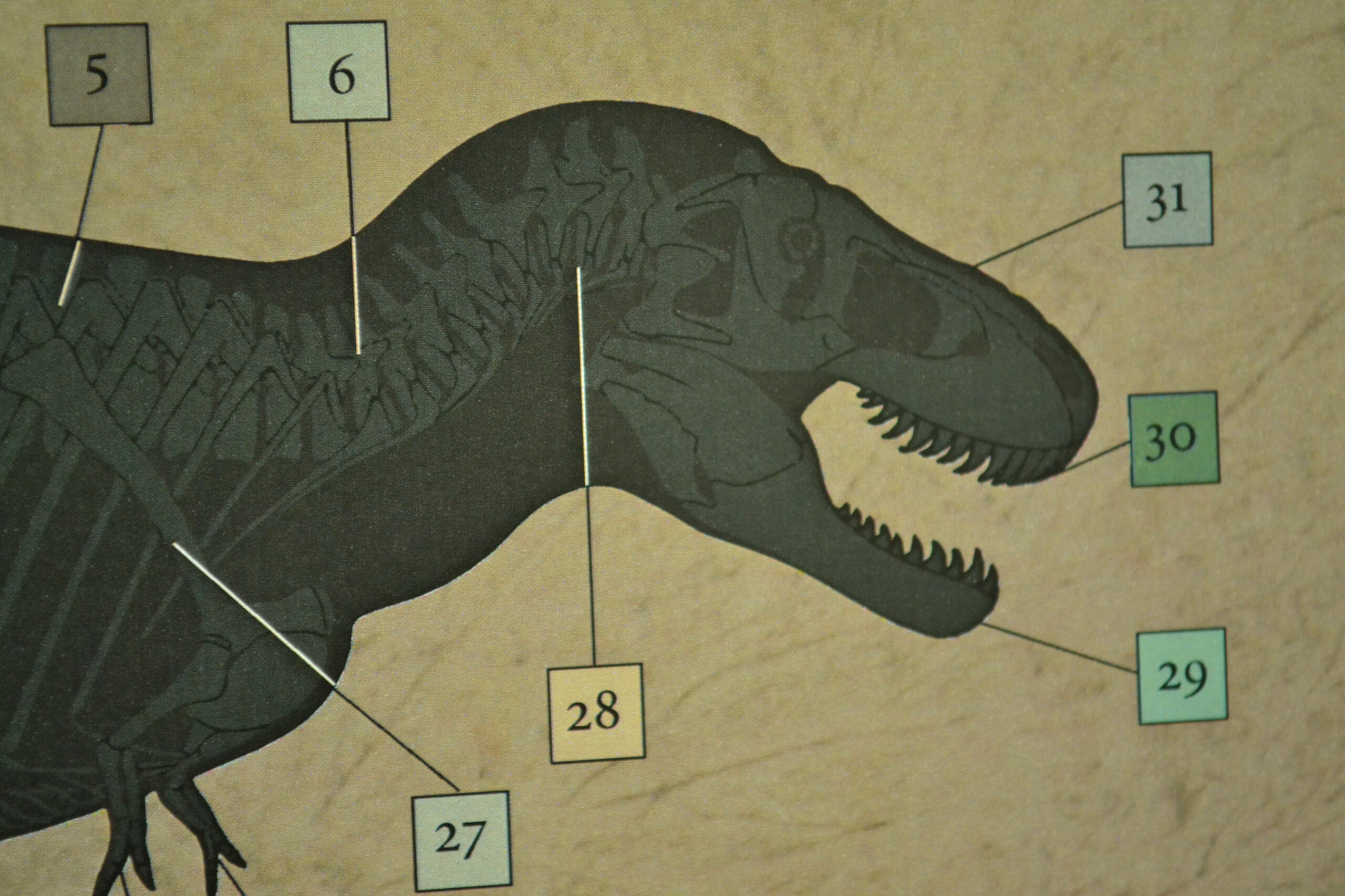
Dinosaur Skeleton Dig Calendar Concept
This project was designed to answer the question, "If you could think outside the box to design a calendar, how would you make it look completely new and unique?" The concept I came up with was a build-your-own dinosaur that drew inspiration from advent calendars and those paleontology dig kits that result in the creation of a tiny dinosaur skeleton model.
How it Works
There are two main areas the user interacts with; the dinosaur "model" and the sticker bone pit below the model. The skeleton is divided into 31 clusters of bones. Each cluster represents one day, and the entire skeleton represents the whole month. The model starts off with a subtle indicator of what bones to look for, and the dates (designed to look like the small flags used at dig-sites) show where to place the bone cluster that day. There is also a colour code for the days of the week for reference in between the model and stickers.Every day, the user needs to first locate that day on the model, then figure out which bone cluster to look for based on where the bones need to be placed. After finding the matching bone cluster in the bone pit, it can be peeled off and stuck to the model.
Design Challenges
A lot of thought went into the order the bones would need to be placed. For example, the spine needed to be placed before the legs so that the legs are layered over it. The skull was also placed last for a coolness factor; this creates incentive for the user to keep searching for bones throughout the entire month, and functions as a reward in the end.After the overall layout was decided, the project was given an additional requirement: the calendar needed to include previews of the previous and following months. To accommodate this change, the stickers needed to be reorganized into a smaller space. To create visual balance, an area of the design was dedicated to additional information describing the dinosaur of the month.

Introduction
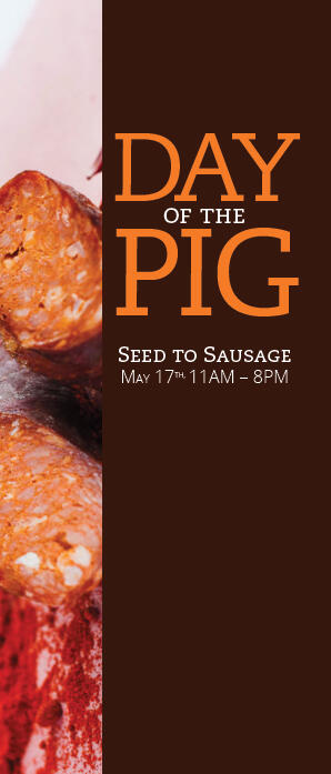
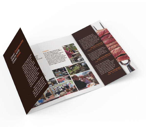
For the Cultural Institution Campaign project for the Graphic Design Program at SLC, I chose Seed to Sausage, a local food store selling hand made meat products. They use locally grown sources and as few additives and preservatives as possible in the creation of their foods. Seed to Sausage hosts a food festival every summer and would like a legal sized brochure to promote the event. A full-page magazine ad will also be created to showcase their products. This campaign will focus on community involvement as well as the health benefits their natural food products offer.
Inspiration
The Seed to Sausage store, itself, is a great place to start. Some inspirational locations would be natural woodland areas and open fields around the Sharbot Lake area. Several farms in and around Sharbot Lake are directly related to Seed to Sausage as they provide the locally grown meats used in their foods. The designated festival location is a great place to check out; the marketing material should be designed with it in mind. There are also other places where community events take place, like the Sharbot Lake park and beach area.
Challenge
The challenge will be to deliver several messages in a succinctly visual fashion. The campaign must demonstrate brand values: that they are dedicated to creating high quality, healthy foods, that they support other local farmers and food sources, that they care about providing healthy food to the community at affordable prices and that they are confident in their practice. At the same time, the campaign must also provide the audience with sufficient information about the event itself.

Project Plan
The main goals were to summarize key information, generate interest and convince people to attend the annual festival. A cohesive visual system was created to link both the brochure and other material to the campaign. A strong metaphor was also required to visually communicate brand values and ideals.The campaign will be successful when any viewer can easily identify the message —even those from urban communities. The layout, typography and other visual elements should also clearly demonstrate the relationship between the brochure and the advertisement.Constraints to keep in mind are the size, format and consistency throughout the campaign. The brochure will be a legal sized horizontal document with three folds while the ad will be a single, vertical letter sized page. Though created for different mediums, each piece must adhere to the same visual structure.

Untitled

Untitled
.

Renaissance Music Initial Website Design
This was a two part project that involved designing home and store pages for Renaissance Music. The first design borrowed a lot of literal elements from the brick and mortar store to create visual metaphors. This was achieved by using the store's brick wall texture as a background, as well as a sheet-music texture for the background on the text boxes. The overall goal was to summarize and organize content, and create a simple and easy to navigate design. Despite the main goals being achieved, the visual design ended up looking busy and didn't create enough contrast, which brings us to the second part of the project:
Website Revisit
The revisit portion of the project built off of the initial design with a new goal in mind: accessibility. The most notable change was to the palette and elimination of intensely textured elements. This created adequate contrast between elements and allowed the viewers' eyes to be guided around the site with ease. The palette was simplified into mostly blue to create visual harmony, and vibrant yellow was used as an accent color to indicate interactive elements. The store page was reformatted to make the text lines shorter and more easy to read. This also allows more images/products to display on the page at a time so users can navigate the page more quickly. The serif font was replaced with sans serif to further improve legibility.


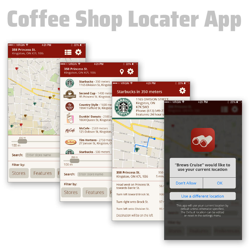
"Brews Crews" Coffee Shop Locater App Design
This app was designed to solve a very specific problem for people who are busy and in a hurry. Using the user's car GPS, it compares the current location with its database of nearby coffee shops and calculates the quickest route. There is then an option that can be enabled to verbally instruct a driver to the coffee shop so that the driver can focus on driving and use the app, hands free.By default, the app would direct users to the closest establishment, however it can also be customized to keep the user's preferences in mind. This could include distance, quality of coffee, service, special promotions.If the phone is tilted on its side, the layout of the app will change to show a map of the entire area. The phone can then sit on the dash were a GPS screen would be located. Alternatively, the phone's screen can be cast to the car's screen if available.
Next Steps
Additional features that would be important to include, especially for drivers) would be a constantly updated status of each location. If the drive-through lineup is longer than usual, this could be visually and verbally indicated to the user to warn them. Alternate locations could then be suggested to help the user find a better solution.

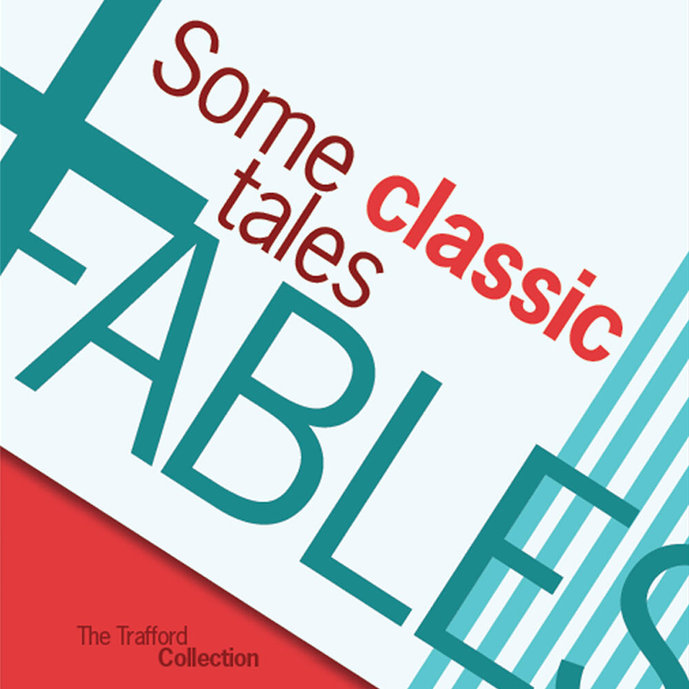
Classic Fables Book Design
Aesop's Fables is a timeless collection of stories that use anthropomorphic animals to convey moral lessons to children. Books from this era were consistant with each other due to their use of a visually pleasing grid system called the "Van De Graff classic book canon." The first part of this project involved designing a book cover and two page spread that embodies this classical book design and adheres to the old fashioned conventions.Apart from following a strict pre-made grid structure, the classic stories were limited to black ink and a single spot color per page. Illustrations were also a main requirement, and were rendered to look like old fashioned wood-cut stamps to give the spreads an antique feel.
Modern Expressive Redesign
The second part of this project was to recognize and break the rules that had been learned and applied to the original design. The grid was avoided completely and replaced with a diagonal layout. Black was removed in favor of a loud red and cyan palette. In the original design, texture ended up being the main way to create visual interest, from the wood-cut stamps to the ornate gold lettering on the cover. To contrast this in the expressive version, the design was rendered flat and drop shadows were only added to make certain areas look like sheets of paper material overlapping each other. Typesetting this version was a challenge, as all of the text was staggered with various colours, weights and capitalizations to put emphasis on specific parts of the story.


Overview
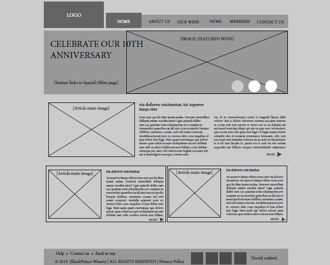
Despite being a first year project, I decided to include this piece in my portfolio because it clearly demonstrates the key steps in a website redesign project; analysis, information architecture, wireframing, and finally the visual design itself. This project is important to me on a personal level because it's the moment I learned that good design isn't just about making things look nice; it's about the planning involved to facilitate functionality. In retrospect, I understand that the end design could have been better (for example the gradients now look dated, and the contrast wasn't as successful as I had hoped).
Rationale
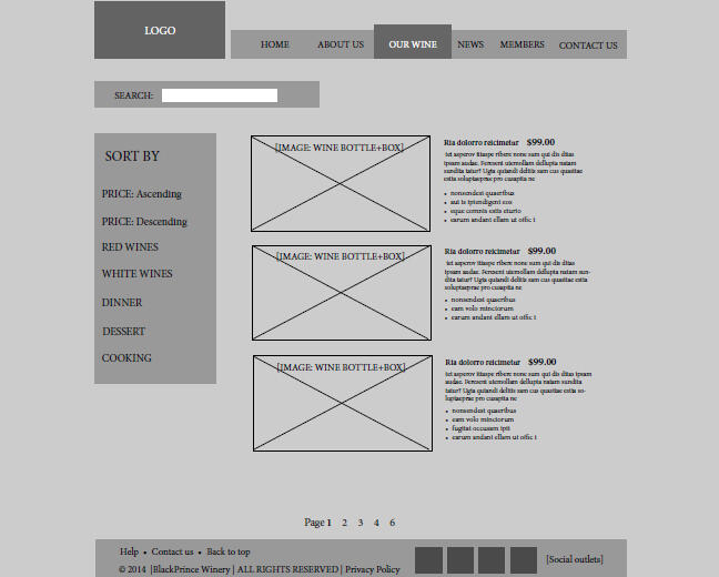
The biggest challenge with reworking this website was the amount of content organization that needed to be done. The most important information is currently very hard to find since everything seems to be shuffled together. The organization of content makes no sense and the content itself is too long and often irrelevant. Unnecessary content was removed and the rest was reorganized using simple, understandable headings in the navigation bar.The old left navigation bar was replaced with a more functional global navigation with relevant headings. Fewer main headings now keep things simple and easy to find. The wine store section includes a new search feature and a side bar to browse through wine quickly. The global navigation remains constant throughout the entire website, unlike in the original design.The entire colour scheme of grey and brown was changed to a luxurious burgundy and ivory pallet, to catch the eyes of viewers, and create clear contrast between elements. The hierarchy of text was fixed, not only with the size and font of type, but with the imagery and feature boxes as well. The current images used for this website lack transparent backgrounds and often have a large white square around them. They are seen randomly placed in between text and don’t relate to the content. These images were replaced with high quality feature images that accurately reflect the content.
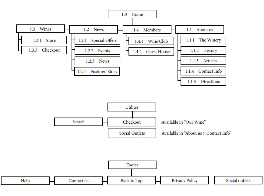
Preliminary Wireframes & Information Design Hierarchy:

Untitled

Untitled

Untitled
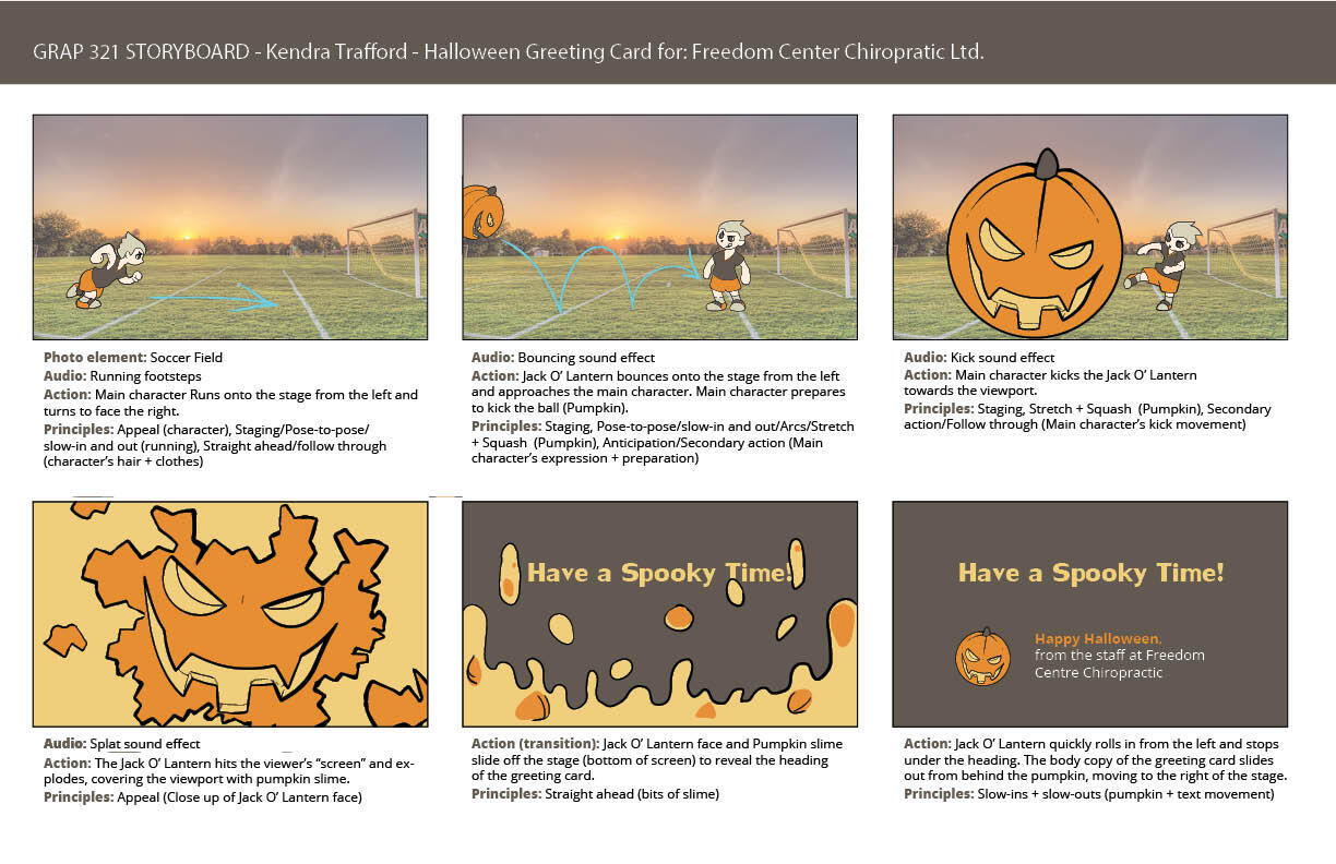
Animated Hallowe'en Greeting Card
This assignment was for our second year Motion Graphics class in the Graphic Design Program at Saint Lawrence. The goal was to create a short animation that included a cartoon character, a photographic background element and a sound effect. It was also important to use at least 2 of the 12 Principles of Animation we learned before the project. The final requirement was that our initial planning storyboard was refined and made presentable by using screenshots of the video at key points in the animation.
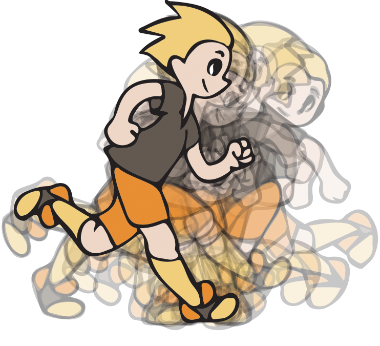
Process
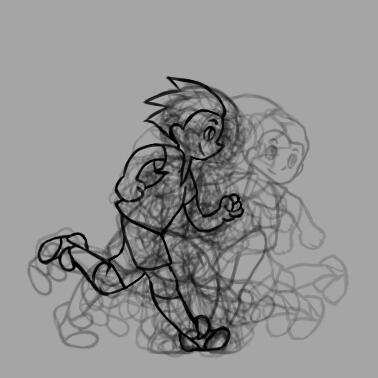
The first step in designing an animated video was to take inventory of all of the necessary components and map them out into a rough storyboard. After studying a few character walk cycles and kicks, the character was sketched as a stick figure performing these actions. When the timing and fluidity looked right, these sketches were refined into simple line drawings in photoshop. The resulting 21 layers/frames of movement were imported into Illustrator for colour and refinement. Since the pumpkin graphic and text elements were more simple to animate, these graphics were created at this time and used the same palette as the main character for consistency. Finally, all of these elements were put together using Adobe After Effects.
Untitled

Untitled

Untitled